29/9/2023 - 27/12/2023 / Week 1 - Week14
Alyssa Lim Shyn Yi / 0365877
Typography / Bachelor of Design (Honours) in Creative Media / Taylor's
University
Final Compilation & Reflection
INSTRUCTIONS
<iframe
src="https://drive.google.com/file/d/1l3pDHj-2sM8bpGPHVvAzQqs_XIV4PANJ/preview"
width="640" height="480" allow="autoplay"></iframe>
TASKS
Task 1: Type Expression and Text Formatting
Task 2: Typographic Exploration and Communication
Task 3: Type Design and Communication
SUBMISSIONS
Task 1 (29/9/2023 - 5/11/2023 / Week 1 - Week 5)
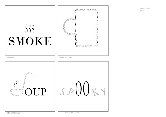
Exercise 1: Type Expression (13.10.2023)
Figure 1.0 (Final Type Expression in JPEG) - (13/10/2023)
<iframe src="https://drive.google.com/file/d/1IERUJ1qoIswWTXC7DF4ByLDYQ6tbhF0m/preview" width="640" height="480" allow="autoplay"></iframe>
Figure 1.1 (Final Type Expression in PDF) - (13/10/2023)
Figure 1.2 (Final Animated Type Expression GIF - " Drunk ") - (20/10/2023)
Task 1 - Exercise 2: Text Formatting
Figure 1.3 (Text Formatting Final Work without Grid in JPEG) - (27/10/2023)
Figure 1.4 (Text Formatting Final Work with Grid in JPEG) - (27/10/2023)
<iframe src="https://drive.google.com/file/d/1icyP9vNw_zXyr5oUDYRaofiHJ5qNO03y/preview" width="640" height="480" allow="autoplay"></iframe>
Figure 1.5 (Text Formatting Final Work without Grid in PDF) - (27/10/2023)
<iframe src="https://drive.google.com/file/d/18LEr2LbjF_oFMOg7dzXt_XsVSKDLhRtg/preview" width="640" height="480" allow="autoplay"></iframe>
Figure 1.6 (Text Formatting Final Work with Grid in PDF) - (27/10/2023)
HEAD
Font/s: Futura Std Bold
Type Size/s: 30 pt
Leading: 32.5 pt
Paragraph spacing: -
BODY
Font/s: Adobe Caslon Pro Regular
Type Size/s: 12 pt
Leading: 14.5 pt
Paragraph spacing:
Characters per-line: 50-58
Alignment: Align Left
Margins: 12.7 mm top, 12.7 mm left + 12.7 mm right + 12.7 mm bottom
Columns: 4
Gutter: 5 mm
Task 2: Typographic Exploration and Communication
(3/11/2023 - 10/11/2023 / Week 6 - Week 7)
Figure 2.0 (Type Expression without Grid in JPEG) - (10/11/2023)
Figure 2.1 (Type Expression with Grid in JPEG) - (10/11/2023)
<iframe src="https://drive.google.com/file/d/1GulUKFibIriuvfOr9DgdNTkMrdNXFw_L/preview" width="640" height="480" allow="autoplay"></iframe>
Figure 2.2 (Type Expression without Grid in PDF) - (10/11/2023)
<iframe src="https://drive.google.com/file/d/1wcyarZ5JI_dAreFFU7-vQ88uTI294gOK/preview" width="640" height="480" allow="autoplay"></iframe>
Figure 2.3 (Type Expression with Grid in PDF) - (10/11/2023)
HEAD
Font/s: Adobe Caslon Pro Regular
Type Size/s: 50 pt
Leading: 60 pt
Paragraph spacing: -
BODY
Font/s: ITC Garamond Std Book
Type Size/s: 9 pt
Leading: 11.5 pt
Paragraph spacing: 4.057 mm
Characters per-line: 40
Alignment: Align Left
Margins: 10mm Top, 10mm Left , 10mm Right , 10mm Bottom
Columns: 3
Gutter: 5 mm
Task 3: Type Design and Communication
Figure 3.0 (Font Design Sketches) - (5/12/2023)

Figure 3.1 (Final Digitalization - " Mamamia " in JPEG) - (5/12/2023)
<iframe src="https://drive.google.com/file/d/1PJKaqTLMdOtATsisJNeBYnmyjtBeMPPj/preview" width="640" height="480" allow="autoplay"></iframe>
Figure 3.2 (Final Digitalization - " Mamamia " in PDF) - (5/12/2023)
Font Tester
You can try to type below using the letters (o l e d s n c h t i g , . ! #).
Link to download font " Mamamia " : https://drive.google.com/file/d/1rs4lk3CrHZO71IARHvEFMP3m9dpnXA6m/view?usp=sharing
Figure 3.3 (Final Kerning in FontLab 7) - (5/12/2023)
Figure 3.4 (Final Typo A4 Poster B&W in JPEG) - (15/12/2023)
<iframe src="https://drive.google.com/file/d/11F61S29udG1oThugR1CTPpAKsFy8RwWA/preview" width="640" height="480" allow="autoplay"></iframe>
Figure 3.5 (Final Typo A4 Poster B&W in PDF) - (15/12/2023)
REFLECTIONS
Experience
I would say that my experience and journey in learning Typography was definitely a hard and challenging one. At the very beginning, when we were first introduced about this module, I actually had not much interest on it. Fortunately, the style and way Mr Vinod's presented his lectures was unique and refreshing which made me picked up the interest in learning techniques about Typography. I was glad that I was able to catch up every week's progress and submissions on time although some of the task were quite challenging and required more time and patience to implement it. Our lecturer was strict but his strict was the reason that made our work to be good and creative
In a nutshell, I realized that Typography is a never-ending learning process, just like life lessons. We learn something new everyday, and we just don't learn from the people who were there before us. For example, other than learning from lecturers, sometimes we could learn from our friends and seniors too. From here, we could gain experience and new perspective on how typography designs worked.
Observations
Ever since I started to learn typography, I realized that my standards in choosing a font had improved. I felt like the lessons that we learnt now was just a tip of the iceberg. There was more for me to explore and learn in the future which I am looking forward to it. Whenever I was on social media these days or going out, I realized that I would examine the signboards, banners, posters and even words labelled on products, and pondered about how the letters are being construct and what were the designers thought of or where they got the idea from when they designed a font.
This module had taught me to be consistency, time management and patience. For example, when constructing letters, consistency is required here as we need to ensure that every letters had the same width and stroke so that they looked like they come from the same typeface family. Time management was also very important not only in Typography but also other work. I learnt that I need to manage my time properly so that I could complete my task on time. Honestly, I think that this module had successfully practice my patience in doing every work as some of the tasks were quite difficult and required more time and effort in doing it.
Findings
Typography is art. It's an art and technique of arranging type to make the written language legible, readable and visually appealing when displayed. It requires discipline and lots of practice to become a good typographer. For example, after I had done a task, it was important to let lecturers to review our work before submitting it. Whenever there's mistakes or changes that need to be made, it is better to follow lecturers' advice and feedback in order to produce a better work. Other than that, I discovered that it is crucial to practice and test a few tasks out whenever doing an exercise. As there's a phrase that goes by " practice makes perfect '.
As a conclusion, I think that this module is great and let me to have a basic understanding about how Typography worked before I took the module, Advanced Typography in the future semester which I am quite looking forward to see how challenging it is.


_page-0001.jpg)
_page-0001.jpg)

.png)


Comments
Post a Comment