Typography Task 3 / Exercises
17/11/2023 - 22/12/2023 / Week 8 - Week 13
Alyssa Lim Shyn Yi / 0365877
Typography / Bachelor of Design (Honours) in Creative Media / Taylor's University
Task 3: Exercise 3
TABLE OF CONTENT
- Sketches (ODHNG/odhng)
- Dissection of Letter (H, o, g, b)
- (o l e d s n c h t i g , . ! #) in approved writing style
- Digitisation of the final work
- Adobe Illustrator to FontLab 7
- Final Kerning in FontLab 7
- A4 Black & White Poster
- Final Poster
- Font Tester
INSTRUCTIONS
<iframe
src="https://drive.google.com/file/d/1l3pDHj-2sM8bpGPHVvAzQqs_XIV4PANJ/preview"
width="640" height="480" allow="autoplay"></iframe>
LECTURES
Week 7
For week 7, we were being brief by Mr Vinod about our task 3 exercises. For
this task, we will need to prepare graph paper and 3 different marker pens
that come with the nib at 3.0 above. Next, we will have to sketch the
following letters ODHNG/odhng
using the 3 pens we had. Moreover, a detail dissection of the letters H,o,g,b
should be done too using the 10 fonts provided by Mr Vinod. Observations
needed to be record in the eportfolio.
Week 8
In week 8, Mr Vinod had reviewed our work and chosen a few preferred
sketch. Then, we were asked to watch a video tutorial and write all the
letters (o l e d s n c h t i g , . ! #)
in the approved style and digitised it.
Week 9 & 10
In week 9 & 10, Mr Vinod gave us lecture on constructing the letters
using strokes, shapes and brush. We were also taught that we should
maintain consistency in constructing letters. Width of every letters
should be the same. Some anchor points can be reduced to make it look
smoother.
Week 11 & 12
In week 11 & 12, we were given the task of creating posters using
the font we had created. We were also being brief about that we needed
to submit our Task 3 E-portfolio in week 13 and also required to do a
compilation of our work since the beginning week of this semester.
EXERCISES
1. Sketches (ODHNG/odhng)
In this task, we were asked to come out with 9 different sketches using 3
different types of pen. Therefore, I have chosen two calligraphy pens and
a brush nib pen to draw my sketch.

Figure 1.0 (Sakura Calligraphy Pen 3.0) - (24/11/2023)

Figure 1.1 (Artline Decorite 3.0, Water Based Pigment Ink) - (24/11/2023)

Figure 1.2 (ZIG Calligraphy Pen 3.0) - (24/11/2023)
My personal preference for the sketch was the sketch in Serifa STD 65
Bold.
2. Dissection of Letter (H, o, g, b)
Before I started to implement this exercise, I went to look up for
information related to the anatomy of a typeface to give myself a better
understanding in this work. Hence, I had noticed that we need to pay
attention to the small details when dissecting the letters such as the
height, letter spacing, baseline and others more.

Figure 2.0 (Image from lecture Type 3 Text P1)

Figure 2.1 (Image from the Internet)

Figure 2.2 (Reference given by Mr Vinod)
After done researching, I begin to dissect my letters along following the
reference above provided by my lecturer. For my dissection, I decided to
choose typefaces with Serifs and Sans Serifs to do. Reasons I choose this
category is because I think that both categories have their own strengths and
weaknesses. Hence, the final decision is still depends on the designer's
preferences and context he or she wanted to present for the audience.
Serif fonts consist of small decorative strokes or lines at the end of a
character. Strokes are presented in different styles liked the image shown
below. However, the most common Serifs typefaces used are Baskerville,
Georgia, Times New Roman and Garamond. Generally, Serifs have been considered
as formal, traditional and easy to read especially in printed material with
long paragraphs such as books or newspapers.

Figure 2.3 (Types of Serifs)
As for Sans Serifs, they do not have any strokes at the end of their
characters. Nevertheless, they are recognized for being modern, easy and clean
to read when it's on digital screen despite of their simplicity. The most
common Sans Serifs typefaces used are Arial, Helvetica, Calibri and Verdana.
The image below shows the types of Sans Serifs.

Figure 2.4 (Types of Sans Serifs)
To summarize up, Serifs for printed material while Sans Serifs for digital
content or anywhere that requires modern typefaces.

Figure 2.5 (Difference between Serifs & San Serfis)
Dissection of Letters (H, o, g, b)
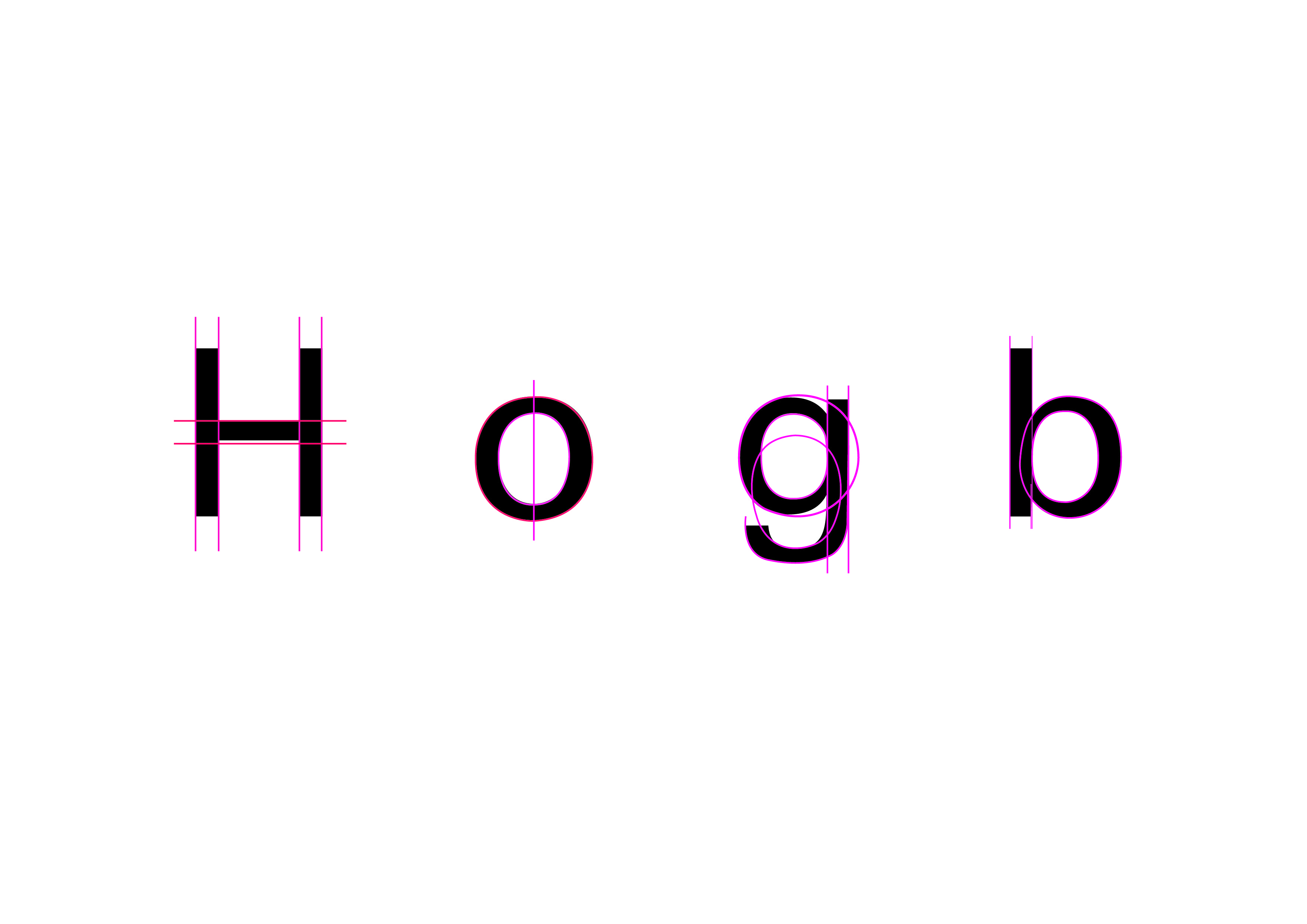
Figure 2.6 (Univers LT Std 55 Roman) - (1/12/2023)
Observations:-
- Letter "H" = Both stems are set vertically straight and harmonious with each other. The inner crossbar is having the same stem size as the stems on the side.
- Letter "o" = The stress is vertical.
- Letter "g" = The closed counter of the letter is similar as letter "o" & "b". However, the black strokes of the bowl can be seen reducing when it's attaching to the stem.
- Letter "b" = Black stroke on the stem stay consistent, but the size of the inner bowl is not the same as the bowl outside. Black strokes of the bowl can be seen narrow when attaching the stem.

Figure 2.7 (ITC New Baskerville Std Roman) - (1/12/2023)
Observations:-
- Letter "H" = The size of the middle stem is not the same as the vertical stems on both sides. The arms of the letter are staying consistently.
- Letter "o" = Vertical stress can be seen. The size of the inner closed counter has been reduced.
- Letter "g" = Vertical axis can be seen at the bowl of the letter "g". The stroke of the ear has been shrink. Stroke of link has been made thinner too. Size of the loop is in a balanced state.
- Letter "b" = The stroke on the head and tail of the stem has been made thinner.
3. (o l e d s n c h t i g , . ! #) in approved writing style

Figure 3.0 - (5/12/2023)
4. Digitisation of the final work
Before I started my digitisation, I had gone through some research to
give myself a better understanding in constructing the letters.

Figure 4.0
Furthermore, we were also instructed to watch lecture videos provided by
our lecturer regarding typeface construction using strokes, brush and
also shapes.
Typo Task 3A Typeface Construction (Shapes)
Side Notes
- Look for a reference of an existing typeface that comes close to the design I've worked on
- Curved area tend to overshoot X-height of the borders of letterform
- Less surface area than a form that has a flat edge
- Some anchor points can be reduced so that we could adjust properly
Typo Task 3A Typeface Construction (Strokes + Brush)

Figure 4.1 (Image from the video)
Anatomy of Typeface
- X-height, descender, ascender space are three different spaces, have letterforms contained within
- During sketching, letter strokes should go below the baseline if they have a descender
- Uppercase letter would go above the X-height line
- Above Cap Line is ascender line
When Using Strokes
- Pen tool is used to create lines or shapes
- Ensure that all the strokes are having the same size
- For circle, turn on scale, scale options and tick the box of scale corners and scale strokes & effects
- To check the thickness, go to stroke window
- There will be unevenness in letters if they are having different thickness
- Before merging the shape, leave the raw shape and place in other artboards
- Merge / unify / unite the shape using pathfinder tool when the letters had done constructing
For Creating Imperfections in Letters
- Object > Path > Outline Stroke
- Pathfinder > Unite
- Object > Compound Path > Make (If the letters didn't unite entirely)
- Use brush to create pattern on the letter
- Object > Path > Outline Stroke
- Pathfinder > Unite
- Lastly, select the whole shape (Pathfinder > Minus)
The image shown below are a few of my drafts while exploring the art in
constructing the letters. For this exercise, we were asked to use Adobe
Illustrator to construct the letters. The format of the artboard must be
1000 X 1000 points. A rectangle with the format of 500pt x 500pt can be
placed inside the artboard above the baseline to measure the letters.
Curved area tend to overshoot x-height of the borders of letterform as
less surface area than a form that has a flat edge. Necessary anchor
points can be reduced so that we can adjust properly.
Command R= Ruler (Drag & drop the guide to identify the lines)
Our font design should also include the basics of Typography:-
- Ascender Height
- Capital Line
- Median Line
- Baseline
- Descender Height
.png)
Figure 4.2 (Digitisation Draft, including shapes, strokes + brush)
Final Digitisation Of The Work
Among all the digitisation draft, I have chosen the draft below as
my final digitisation artwork. Here's the link to download the font. My font name is "Mamamia".
Figure 4.3 (Final Digitisation Of My Letters in JPEG) - (5/12/2023)
Figure 4.4 (Final Digitisation Of My Letters in PDF) - (5/12/2023)
<iframe
src="https://drive.google.com/file/d/1PJKaqTLMdOtATsisJNeBYnmyjtBeMPPj/preview"
width="640" height="480" allow="autoplay"></iframe>
.png)
Figure 4.5 (Basics of Typography) - (5/12/2023)
Ascender Height: 731.89 pt
Cap Line: 652.97 pt
Median Line: 467.49 pt
Baseline: 0 pt
Descender Height: -205 pt
Adobe Illustrator to FontLab 7
After digitizing our work in Adobe Illustrator, we were asked to
download FontLab 7 (Demo Version) and place all the letters and
punctuation into it ( o l e d s n c h t i g , . ! # ). The images
shown below are chart talking about side bearings of letters. The
charts are provided by my lecturer.
.png)
Figure 4.6 (Sample chart for estimating uppercase letter side bearing values)
.png)
Figure 4.7 (Sample chart for estimating lowercase letter side bearing values)
The image below is one of the instruction that we need to follow
before starting to adjust our letters in FontLab 7. When setting
preferences, we need to tick a few options as below:-
- Keep stroke and colors, place color elements
- Import original position: prefer AI vector format
- Keep position if available (Keep artwork size)
- Pasting contour to another element preserves appearance
.png)
Figure 4.8 (Setting preferences)
.png)
Figure 4.9 (Coordinates Rounding)
.png)
Figure 5.0 (Side-bearings before) - (5/12/2023)
.png)
Figure 5.1 (Side-bearings after) - (5/12/2023)
.png)
Figure 5.2 (Testing out the font) - (5/12/2023)
.png)
Figure 5.3 (Process) - (5/12/2023)
Final Kerning in FontLab 7
.png)
Figure 5.4 (Final Kerning in FontLab 7) - (5/12/2023)
A4 Black & White Poster
We were given the task to create posters as our final task. The poster must be A4 size in black and white, every font size must be the same and we must use the font that we created. For the words, I had chosen a phrase known as "silence holds echoing night". Therefore, I decided to play around with a few designs as shown below.
.png)
Figure 5.5 (Process for poster) - (15/12/2023)
.png)
Figure 5.6 (Drafts for poster) - (15/12/2023)
Final Poster

Figure 5.7 (Final Poster in JPEG) - (15/12/2023)
<iframe
src="https://drive.google.com/file/d/11F61S29udG1oThugR1CTPpAKsFy8RwWA/preview"
width="640" height="480" allow="autoplay"></iframe>
Figure 5.8 (Final Poster in PDF) - (15/12/2023)
Font Tester
You can try to type below using the letters (o l e d s n c h t i g , . ! #).
FEEDBACK
Week 8: Summary of my lecture
General Feedback:- Sketching should be consistent.
Week 9: Summary of my lecture
Specific Feedback:- Letters are somehow consistent when using pen tool to construct the letters.
General Feedback:- Should have use shapes to construct the letters.
Week 10: Summary of my lecture
Specific Feedback:- The letter (e, d, c, g) can be obtained from the letter "o".
General Feedback:- Ensure that every letters are having consistency.
Week 11: Summary of my lecture
Specific Feedback:- Letter (s, t, c) needs more work in doing the shapes.
General Feedback:- Width of every shape should be the same without adjusting them when constructing the letters.
Week 12: Summary of my lecture
Specific Feedback:- Shadow behind the main letters can be reduce to 10%.
General Feedback:- Too much negative spaces in poster.
REFLECTIONS
Experience
In my overall experience, I must say that this task
is the most hardest task for me than the previous
task we did. It was my first time in designing a
font and I never knew that it was so hard. It really
requires our patience, precision and consistency
while implementing our work. Sketching a font was
easy but digitalizing it was hard. However, I am
glad to have Mr Vinod's guidance and teaching. After
watching his lecture videos on repeat and observe
other people's work, I finally had better
understanding in what should I do when constructing
the letters. For example, we should ensure that
width and strokes in every letters should remain
their consistency without adjusting them while
constructing the letters.
Nevertheless, I was happy that we could create our
own type of font and bring it to real life using
Fontlab 7. I was satisfied with my final outcome
too.
Observations
I was grateful to have this lesson as we get to
learn the techniques in constructing nice and
creative letters although I honestly felt stressed
while doing this work. Furthermore, I could finally
understand how all the letters worked and the hard
work & effort that a designer had put
into. From this task, I had learnt to develop a new skill to construct a readable and legible. Other than that, I had also managed to design a font with consistent characteristics premised on research and analysis.
Findings
I realized small letters were harder to
construct than the capital letters as small
letters tend to have more curved areas that need
to be take care of. I would say that this work
required much research before carried out our
work. By doing research, we could expand our
perspective and knowledge in constructing unique
letters.
FURTHER READING
For my week 9 further reading, I had chosen a book named "I.D.E.A.S. -
Computer Typography Basics" founded by David Creamer in 2003. Just like its
title, this book discussed on the topic of typography basics in
computer.

Figure 1.0 (Book Cover)
Introduction
The first goal of typography was readability. A page has failed its main
purpose if the font used in the page is hard to read no matter how pretty or
unique the page is. When a person chooses a certain font or adjusts the
margins to create more white space, he or she can become a designer. By
learning about the differences between fonts and how fonts worked in different
pages or situation, the designer will be able to create an article that is
easy to read and understand.
Categories of Fonts
Fonts come in many different designs. The differences maybe subtle while some
stand out like the proverbial "sore thumb". There are two major categories
which are serif and
sans serif. However, these
simplified categories are insufficient for great variety of fonts that one
might encounter on today's computers. Hence, the examples shown below are the
expanded categories to show the difference:-
- Serif
- Sans Serif
- Mono-Spaced
- Display
- Script
- Text
- Dingbats
Serif

Figure 1.1 (Examples of Serif Fonts)
- Work nicely for headline fonts
- They are the little feet or arms that hang off the end of letter strokes & thick/thin look is added to the letter
OLDSTYLE
- Based on classical Roman inscriptions
- Letters are very open, wide & round with pointed
- Have pleasing contrast between the heavy & light strokes
MODERN
- Based on fonts designed over 200 years ago
- Have a greater degree of mechanical perfection than Oldstyle fonts
- Greater distinction between the heavy/light strokes, and thin/squared off
serifs
SQUARE SERIF
- Slab Serifs are a contemporary style used mainly for small amounts of text
such as advertising copy, subheads & headlines
- Have square serifs and mostly uniform strokes with little contrast
Sans Serif

Figure 1.2 (Example of a Paragraph set in a Sans Serif font, Futura)

Figure 1.3 (Examples of Sans Serifs Fonts)
- No serifs, usually have an overall even stroke weight which creates little contrast for the letters
- Evoke a more modern look in report but can be harder to read than Serif fonts
- Generally used for small amounts of copy, subheads & headlines
- Can be used for larger amounts of body copy, if applied with care
Display

Figure 1.4 (Examples from Thousands of Different Fonts set at 46pt)
- Designed to be used as attention-getting headline fonts
- Should rarely, if ever, be used as body copy fonts
Script

Figure 1.5 (Examples of Script Fonts)
- Designed to mimic handwriting, therefore it is designed to touch one another
- Fonts may be more traditional type used for formal invitations
- Should never be used in every capital letters
Text

Figure 1.6 (Examples of Text Fonts)
- Made by early monks for religious books based on the hand-drawn letters
- Text fonts have an "Old-World" feel to them
- Mostly used in certificates, diplomas and invitations
- As with Script fonts, they should not be used in all capital letters
Mono-Spaced

Figure 1.7 (Examples of Mono-Spaced Fonts)
- Proportionally spaced; that is, smaller characters take up less space than larger ones
- Example, letter "i" is not as wide as the letter "M"
- In contrast, mono-spaced fonts which are usually typewriter-style fonts, take up the same amount of space regardless of the actual letter
Dingbats

Figure 1.8 (Examples of Dingbat Fonts)
- Symbols that are small pieces of art used to enhance the design of the text or page
- The most common dingbats are Zapf Dingbats & Wingdings
- There are thousands of different designs available
QUICK LINKS

Comments
Post a Comment