27/9/2023 - 3/11/2023 / Week 1 - Week 5
Alyssa Lim Shyn Yi / 0365877
Illustration & Visual Narrative / Bachelor of Design (Honours) in Creative Media / Taylor's University
TASK 1 EXERCISES
TABLE OF CONTENT
1. Instructions
2. Lectures
3. Tasks
Instructions
<iframe src="https://drive.google.com/file/d/1zqU77vDefsCTRAO7uY281FRQo4Xgm9EP/preview" width="640" height="480" allow="autoplay"></iframe>
Lecture
Week 1 Lecture
After we had finished our class briefing, our lecturer asked us to play a game called Bezier using our computer or laptop. It's quite challenging for me in the beginning as a first timer to play the game however I managed to completed it using 12 nodes after practicing for couple of times. It's fun and challenging to practice with Bezier.
Link: https://bezier.method.ac/
Week 2 Lecture
<iframe src="https://drive.google.com/file/d/1fbdjPxBRxMb20Dxei4GnuJRm8qaeIqbf/preview" width="640" height="480" allow="autoplay"></iframe>
Summary Of My Lecture
In week 2, we were briefed by Mr Hafiz on the basics of designing a character. It had to be iconic, simplicity and unique enough to attract people's attention. There are several principles of character design such as shapes, colour, emphasis, contrast, harmony, expressions and poses. Every element inside a character played an important role in defining themselves.
- Shapes = Design a character's silhoutte
- Colour = Establish the basic roles of the characters
- Emphasis, Contrast = Exaggerate to memorate
- Harmony = Every elements in your design should compliment each other
- Expression, Poses = Expressive emotive characters, win the audience
Week 3 Lecture
<iframe src="https://drive.google.com/file/d/1WVziXGZ8xF9KxaBkhG_HjZfwCDR7sMl9/preview" width="640" height="480" allow="autoplay"></iframe>
Summary Of My Lecture
For this lecture, we had learnt about Chiaroscuro. It's an Italian term referred to ' light-dark '. It is the use of light and dark to create the illusion of three-dimensional volume on a flat surface. The purpose of chiaroscuro is to increase the scene's dramatic tension by exaggerating the subject's importance using colour or light contrast.
Reasons why chiaroscuro is used in visual narrative is because this method is an excellent lighting choice to differentiate positive and negative spaces. Positive space refers to subject matter or object of interest in a visual while negative space refers to the filled space or background that surround subject matter or object of interest in visual.
Hence, it can also be used to increase dramatic tension, create sensational effect, attract attention and make tasteful composition.
Tasks
Exercise 1 : Vormator Challenge
During week 2, Mr Hafiz brief us about using shapes provided by him to create a character with our creativity. The challenge is known as Vormator challenge. Vormator challenge refers to produce work with using only limited shapes and strict set of rules. Every person will receive the exact same shape in this challenge. I found out that this challenge truly required a person's imagination and creativity in this project. In this challenge, we are allowed to flip, rotate and duplicate the elements. We can also add, subtract and intersect the elements. Color is not restricted, we can come out with our own color schemes. Other things such as gradient, strokes, filters or effects are allowed too.
The image shown below is the shapes provided by Mr Hafiz.
Figure 1.0 (Shapes provided)
The figure below is one of the exercise by using pen tool to trace the outline of the shapes.
Figure 1.1 (Shapes Tracing)
Figure 1.2 below is a character tracing created by me. The idea of me creating this character comes from robots. Hence, I designed it into a mini robot with using the elements provided above. The colour that I used is black and white only.
Figure 1.2 (Vormator Tracing)
Final Work on Vormator Challenge
The figures shown below are my final work for vormator challenge. I had this idea inspired by the Japanese famous Daruma doll. Hence, I decided to challenge myself to recreate a Daruma doll using the limited shapes. In Japan, Daruma dolls symbolized perseverance and good luck. Red daruma symbolized good luck and believed to ward off evil whereas blue daruma symbolized intended to succeed in passing exams or at work.
Figure 1.3 ( Tracing )
Figure 1.4 ( Final Outcome )
Game Card Design
For this game card design, I decided to pick the red Daruma doll as my game character. Its health is infinity and it has the ability of bringing fortune and good health. I also added a Japanese theme background to fit my character and also decreasing the background opacity to about 36%.
Figure 1.5 (Initial Process)
As Mr Hafiz said that we could not use pictures as background, we were told to use Adobe Illustrator to come out with a background design based on our character design. Therefore, I decided to choose a few warm colours as my background to match my character.
Figure 1.6 (Final Outcome)
Exercise 2: Chiaroscuro Exercise
Our first chiaroscuro exercise was to trace a pear using pen tool and pathfinder tool to draw the outline and also divide it. As for the shadow, we were asked to use the pencil tool to trace out the shadow and use a darker colour than the original pear colour. Next, we had to use the knife tool to cut the pear into slices. Then, we have to use pen tool to draw the insides of the pear and colour it.
Figure 2.0 (Tracing of Pear)
Figure 2.1 (Slicing the pear using knife tool)
Figure 2.2 (Using pen tool to draw the inner layer of pear)
Figure 2.3 (Final Outcome)
After the exercise above, we were asked to trace out the shadows of skull and place it onto the pear as it was its own shadow.
Figure 2.4 (Picture Given)
Figure 2.5 (Process)
Figure 2.6 (Skull Shadow on Pear)
Chiaroscuro People Exercise
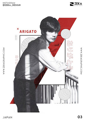
In this exercise, we were given a picture of people and our task is to apply the chiaroscuro pear exercise technique onto the people.
Figure 2.7 (Picture Given)
Figure 2.8 (Process)
Figure 2.9 (Final Outcome) Figure 3.0 (Final Outcome)
Figure 3.1 (Final Outcome) Figure 3.2 (Final Outcome)
Reflection
Throughout the past five weeks, I had discovered that this subject is fun and interesting to learn. After all the exercises I had gone through, I could feel that I am starting to get familiar with Adobe Illustrator. I was happy that I could learn all these new skills and can't wait to used these skills in my coming future exercises or projects.

.png)


.png)
.jpg)
.png)
.png)


.jpeg)
.png)


.png)


Comments
Post a Comment